D&M
T:400-991-6008
爱尔视光品牌全案 | 飞向更蔚蓝的视界
Aier Ophthalmology Brand Full Cas │ Fly To Visual
爱尔视光是国内唯一同时具有医疗专业背景和全国连锁优势的品牌。
我们为此进行全面的思考及品牌梳理,并对它进行了完整的品牌策略搭建、VI升级以及全新的SI设计。
Aier Ophthalmology is the only brand in China with both medical professional background and national chain advantages. We have carried out comprehensive thinking and brand combing for this, and carried out a complete brand strategy building,
VI upgrade and new SI design for it.

“作为眼科行业的领导品牌,爱尔视光应该以一个领导者应有的高度责任感与使命感,站在引导和启迪的高度给予青少年启发。” ——D&M观点
As a leading brand in the ophthalmology industry, Aier Ophthalmology should be a leader with a high sense of responsibility and mission, standing at the height of guidance and inspiration to inspire young people." ——D&M’s view

*消费者洞察 Consumer Insight
爱尔视光主要针对6~17岁的儿童和青少年,正处于学习成长阶段,刚躲开学习,又陷入游戏,大量用眼。我们认为应从目标消费者的需求出发构建品牌的功能价值和情感价值。他们需要的不仅仅是做好近视防控,矫正视力,更加需要的是,一个强烈的声音时刻提醒他们:远离电子屏幕,多到户外走走。
Aier Ophthalmology is mainly aimed at children and adolescents aged 6~17, who are in the stage of learning and growth.They have just avoided learning but are also caught up in games, using their eyes extensively.We believe that the functional and emotional value of a brand should be constructed based on the needs of target consumers. What they need is not only myopia prevention and correction, but also a strong voice reminding them to stay away from electronic screens and go outdoors more.

*社会痛点关联 Social Pain Point Association
国家推动“双减”政策和APP青少年防沉迷模式全面落地,希望未来的青少年可以适当抽离屏幕,去发现更多有趣的事,探索更多成长的可能。
The state has promoted the "double reduction" policy and the APP youth anti-addiction model to fully implemented, hoping that future teenagers can properly withdraw from the screen to discover more interesting things and explore more possibilities for growth.

*品牌独特利益Brand Unique Benefit
爱尔视光倡导共享全球眼科智慧,使所有人,无论贫穷富裕,都享有眼健康的权利。在眼科医生、先进仪器、顶尖技术及理论研究等全球眼科智慧的整合上,相信爱尔已经做得很好。但是,如果依然停留在这上面,未来很有可能陷入价值同质化的陷阱。
Aier Ophthalmology advocates the sharing of global ophthalmic wisdom, so that all people, regardless of wealth or poverty, can enjoy the right to eye health.We believe that Aier has done a great job in integrating global ophthalmic wisdom, including ophthalmologists, advanced instruments, cutting-edge technology, and theoretical research. However, if it still stay on this, it is likely to fall into the trap of value homogenization in the future.
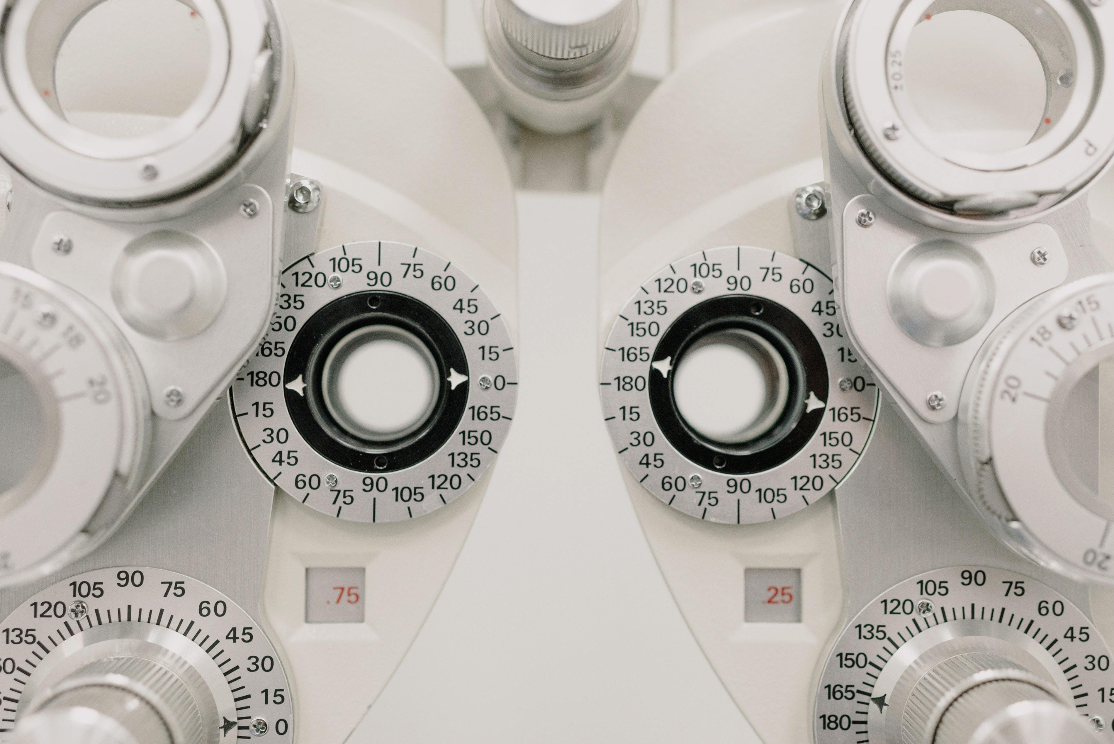
D&M认为,作为眼科行业领导品牌,爱尔视光现阶段更应聚焦ESG发展。
D&M thinks, as a leading brand in the ophthalmic industry, Aier Ophthalmology should focus more on ESG development at this stage.

一方面实现引领行业,促进行业的良性发展,让同行及上下游的合作伙伴看见更多的善意和可能;另一方面实现引导并启迪消费者,爱尔不仅是眼科专家,更应该扮演着一个教育者的角色,引导青少年远离屏幕光,拥抱自然与健康。
On the one hand, it leads the industry and promotes the benign development of the industry, allowing peers and upstream and downstream partners to see more goodwill and possibilities;on the other hand, to guide and enlighten consumers, Aier is not only an ophthalmologist, but also should play the role of an educator, guiding teenagers to stay away from the screen light, embrace nature and health.

爱尔视光,
是近视防控,
更是引导与启迪。
Aier Ophthalmology
is myopia prevention and control,
but also guidance and enlightenment.
我们提出的策略体系?
What is the strategy system we propose?

哪一种自然光对视力有利?
我们必须从科学的角度寻找答案。
What kind of natural light is good for vision?
We must look for the answer from a scientific point of view.


以“蔚蓝”为核心构建爱尔视光品牌差异化。
Build Aier Ophthalmology brand differentiation with "Blue" as the core.
*爱尔视光品牌定位
Aier Ophthalmology brand positioning
以“蔚蓝”启迪科技防控近视
Using "Blue" inspiration technology to prevent and control myopia.

*爱尔视光命名
Name the Aier Ophthalmology
爱尔蔚蓝视光
Eye Blue Ophthalmology

*爱尔视光SLOGAN
Aier Ophthalmology SLOGAN
飞向更蔚蓝的视界
Fly To Visual

*爱尔视光“近视防控蔚蓝理论”价值体系
The Value System of Aier Ophthalmology's "Blue Theory for Myopia Preve
理念先行:蔚蓝护眼运动
科技助力:蔚蓝近视防控科技
服务至上:蔚蓝近视防控服务
Concept First:Blue Eye protection exercise
Technology assistance:Blue Myopia prevention and control technology
Service-oriented:Blue Myopia prevention and control services
*爱尔视光“近视防控蔚蓝理论”话语体系
The Discourse System of Aier Ophthalmology's "Blue Theory for Myopia Prevention and Control"
品牌层面:走向蔚蓝,更是走向爱尔视光
技术层面:“近视防控蔚蓝理论”提出者
服务层面:治愈近视防控,从蔚蓝开始
Brand level:Go to the Blue, but also go to the Aier Ophthalmology.
Technical level:Proposer of "Blue Theory for Myopia Prevention and Control".
Service level:Cure myopia prevention and control, starting from blue.
*爱尔视光品牌个性
Aier Ophthalmology Brand personality
强大而充满探索精神
创新而洋溢人文关怀
Powerful and full of exploratory spirit
Innovative and full of humanistic care

*爱尔视光品牌DNA
Aier Ophthalmology Brand DNA
包容、开放、自由、健康
Inclusive, Open, Free, Healthy

*爱尔视光品牌故事
Aier Ophthalmology Brand Story
一个充满善意,给人启迪的品牌故事。
爱尔视光是"近视防控蔚蓝理论”的提出者,一个对头顶蔚蓝天空充满惊奇和敬畏的近视防控及引导与启迪品牌。
A brand story full of goodwill and inspiration.
Aier Ophthalmology is the proposer of "Blue Theory for Myopia Prevention and Control", it is a brand that is full of surprise and awe towards the blue sky above, guiding and inspiring myopia prevention and control.

爱尔视光坚信“以蔚蓝启迪科技防控近视”,希望儿童及青少年能够走向蔚蓝,探寻更多不一样的成长可能,而不是埋头教材与电子屏幕。
Aier Ophthalmology firmly believes in "using Blue inspiration technology to prevent and control myopia", and hopes that children and teenagers can go to blue and explore more possibilities for growth, rather than immersed in teaching materials and electronic screens.


完成品牌核心梳理只是第一步,接下来是通过最直观的视觉表达传递品牌核心。围绕“走向户外,亲近自然”前期梳理出来的核心理念,去筛选符合品牌的素材,从而创造爱尔视光独特的品牌符号。
Completing the brand core carding is only the first step, and the next step is to convey the brand core through the most intuitive visual expression.Around the core concept of "going outdoors and getting close the nature"sorted out in the early stage,to screen materials that meet the brand, so as to create a unique brand symbol of Aier Ophthalmology.
“我们希望创造的是一个视觉的载体,它能连接过去,也能指向未来。”
"What we hope to create is a visual carrier that can connects the past and also points to the future."

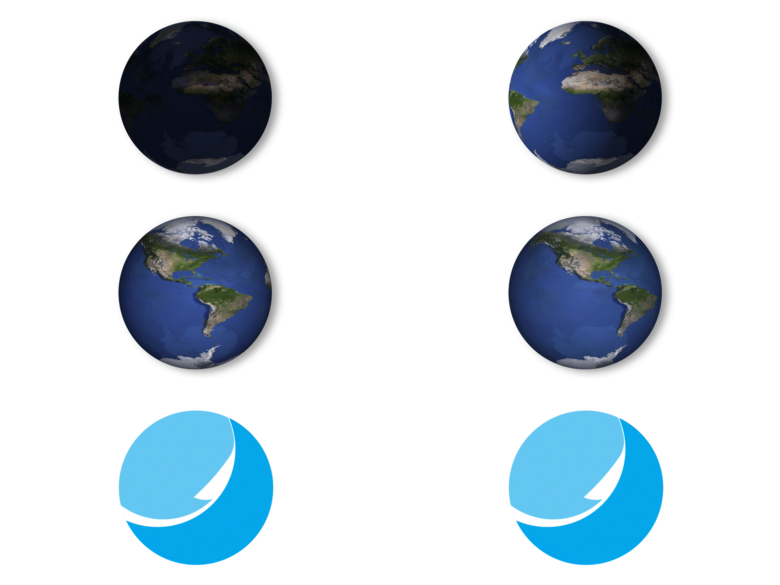
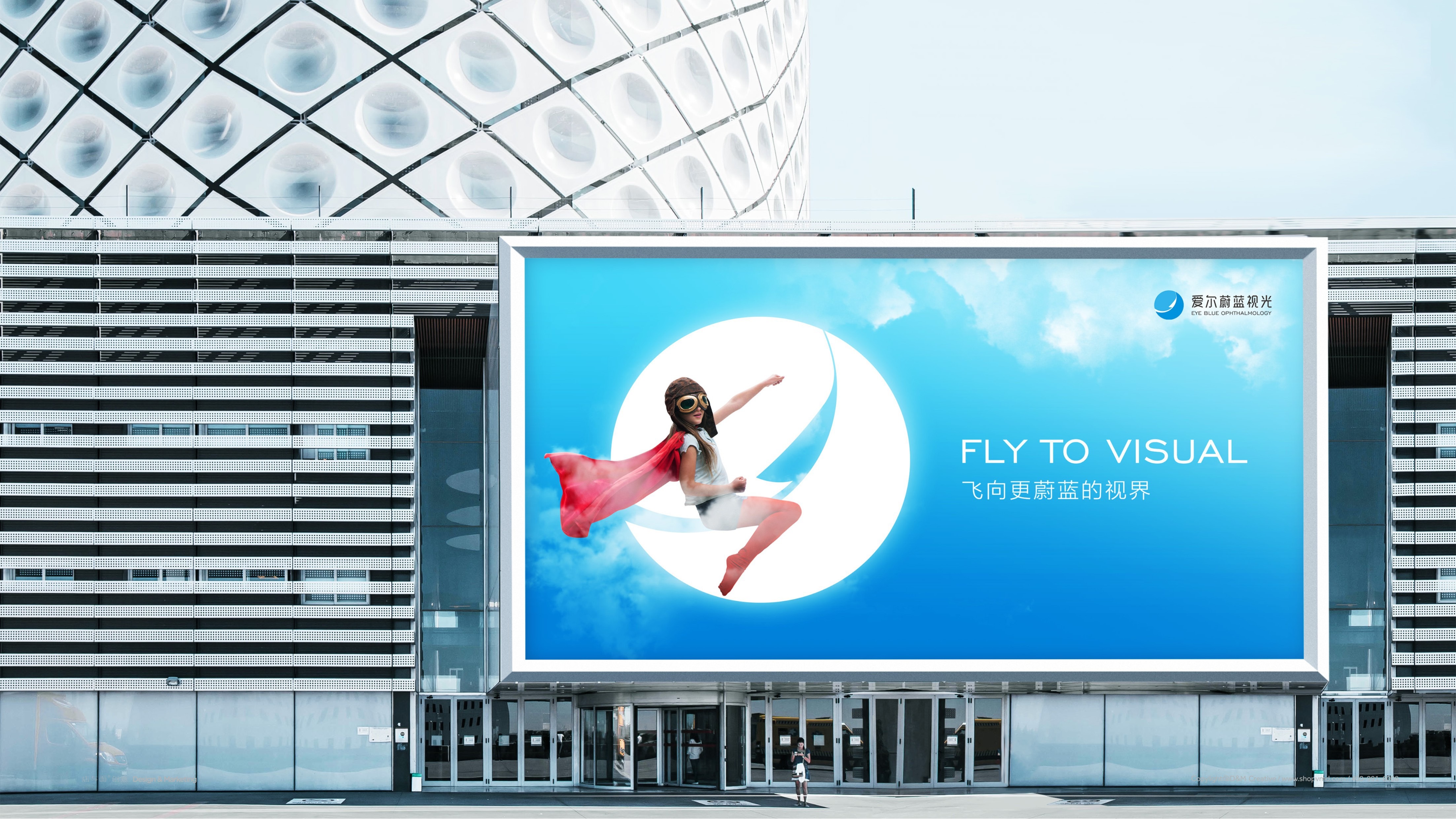
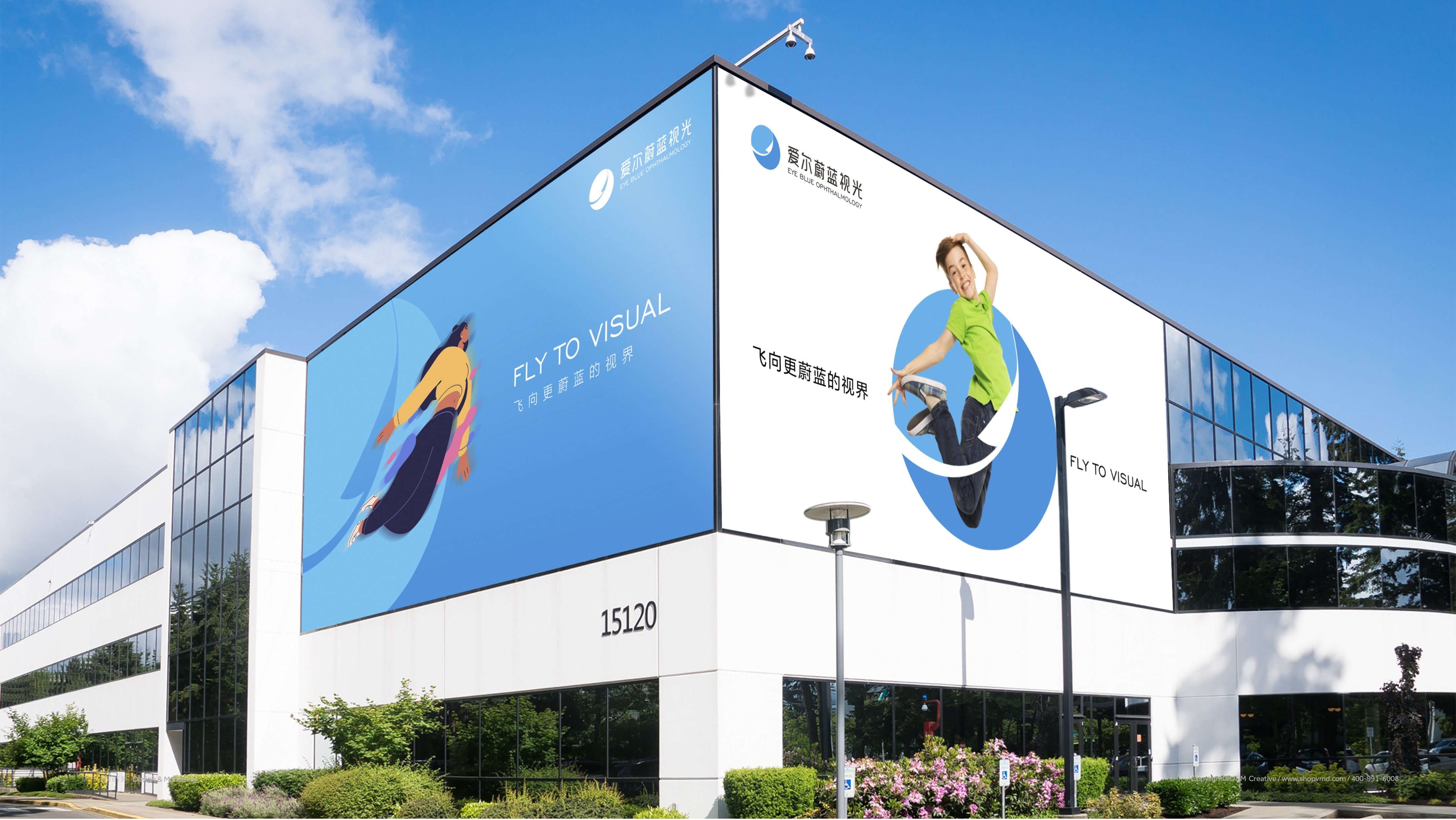
在感性直觉和理性思考的双重验证下,我们提取了代表童年的纸飞机和面向未来的天空与地球二者为设计原形去创造爱尔视光的视觉符号。以扁平化、简约的设计风格追随潮流趋势,圆形的形体象征美好与包容,科技蓝和清透蓝不仅代表专业与活力,更是地球与天空的主色调。在广阔无垠的天地间,载着千千万万青少年梦想的纸飞机终将起航,放飞青春活力,拥抱美好的蔚蓝世界。
Under the double verification of perceptual intuition and rational thinking, we extracted the paper plane representing childhood and the sky and earth facing the future to create the visual symbols of Aier Ophthalmology for the design prototype.Following the trend with the flat and simple design style, the round shape symbolizes beauty and inclusiveness, and the technology blue and clear blue not only represent professional and vitality, but also the main colors of the earth and sky.In the vast and boundless world, the paper plane carrying the dreams of millions of young people will finally set sail, flying youth and vitality, and embrace the beautiful blue world.

*LOGO符号的延展和多种可能性
Extension and Multiple Possibilities of LOGO Symbols

*VI运用展示
VI Application display
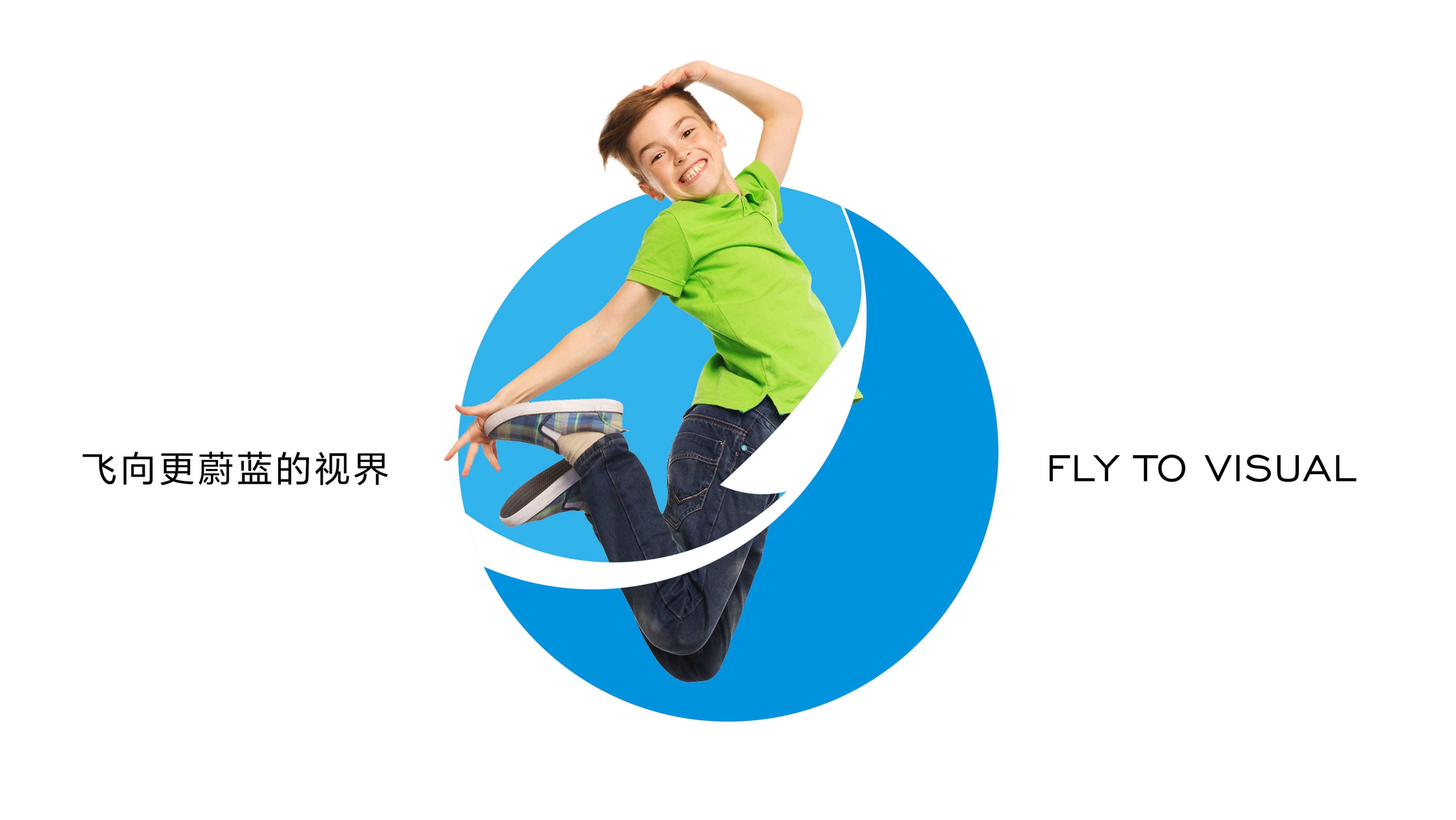
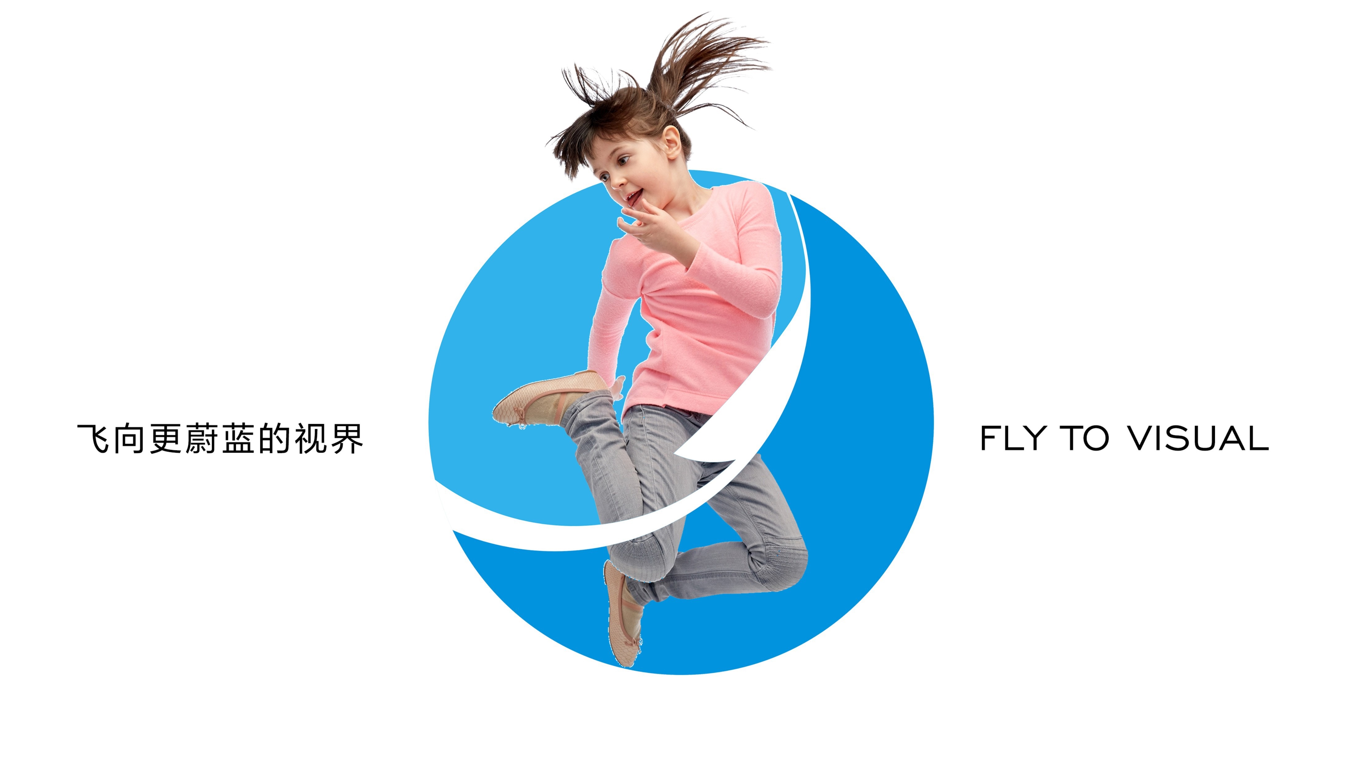

*以蔚蓝构建统一语境
Constructing a Unified Context with Blue
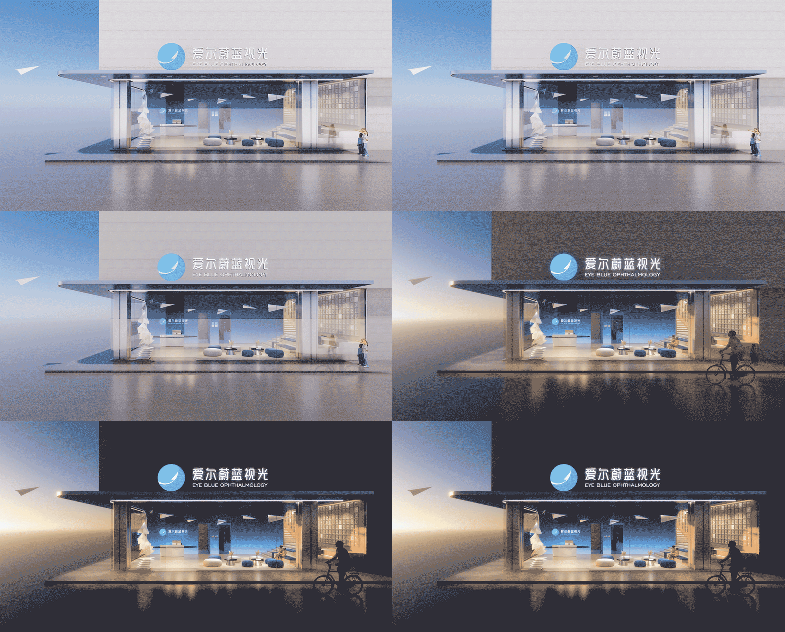
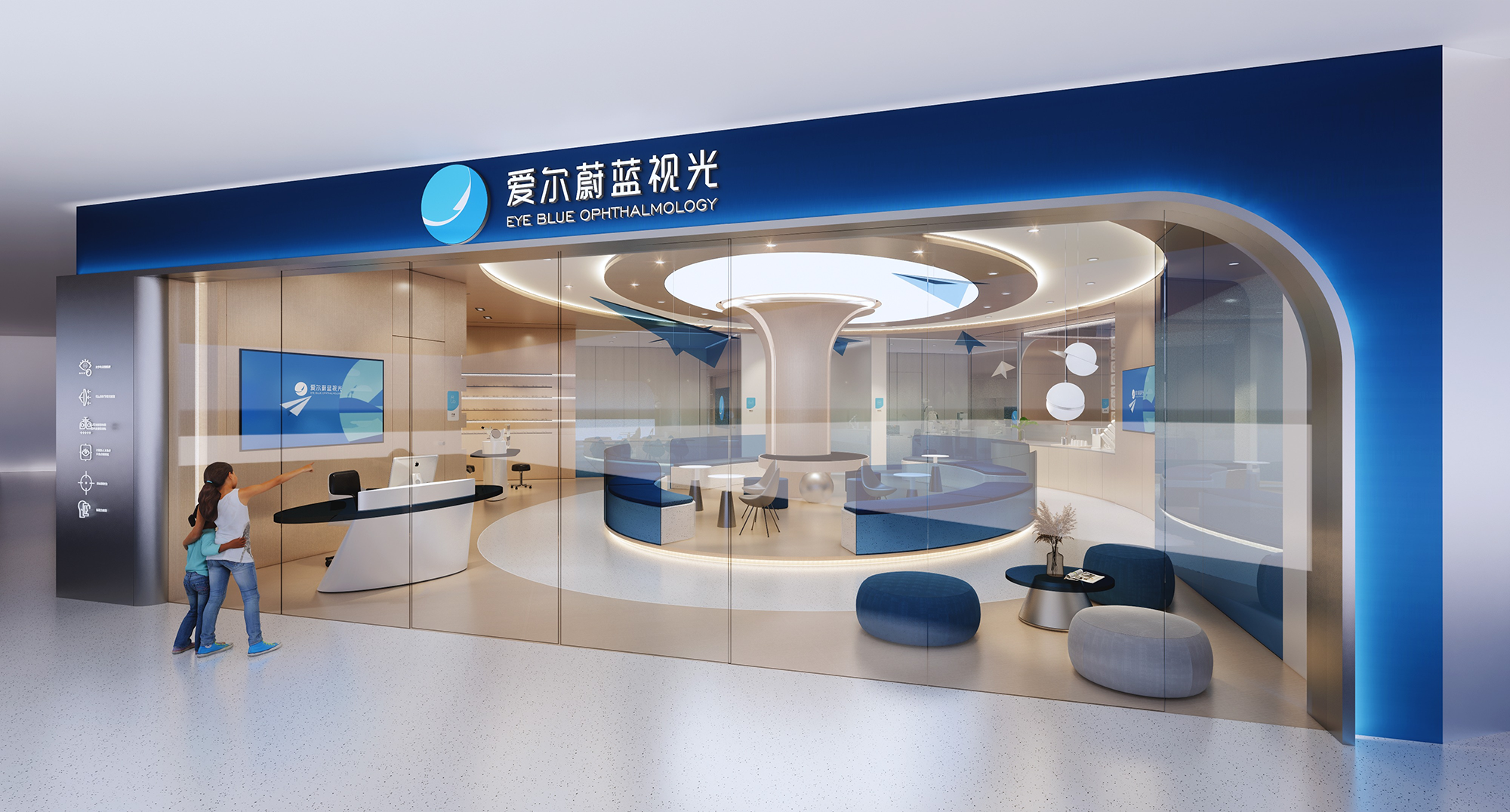
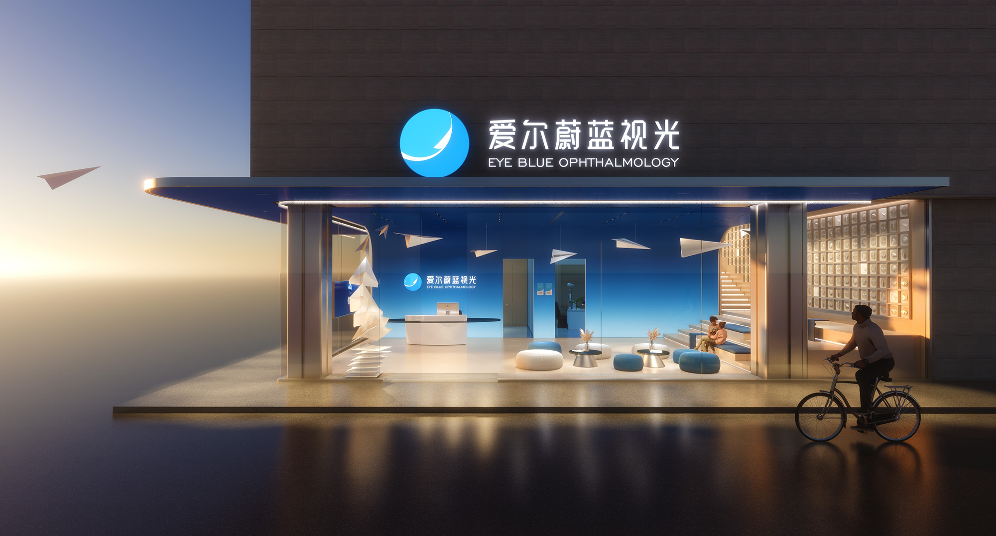
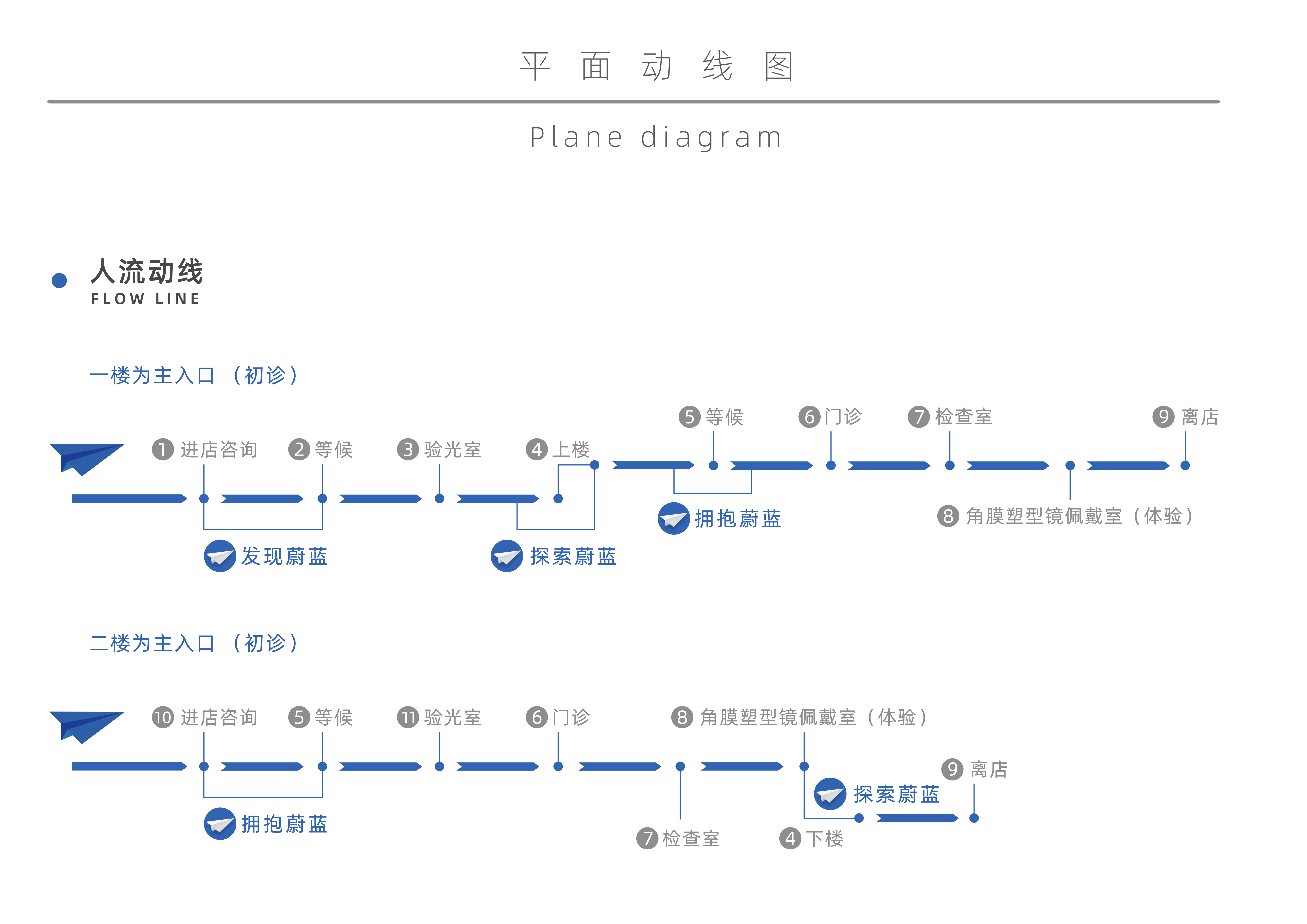
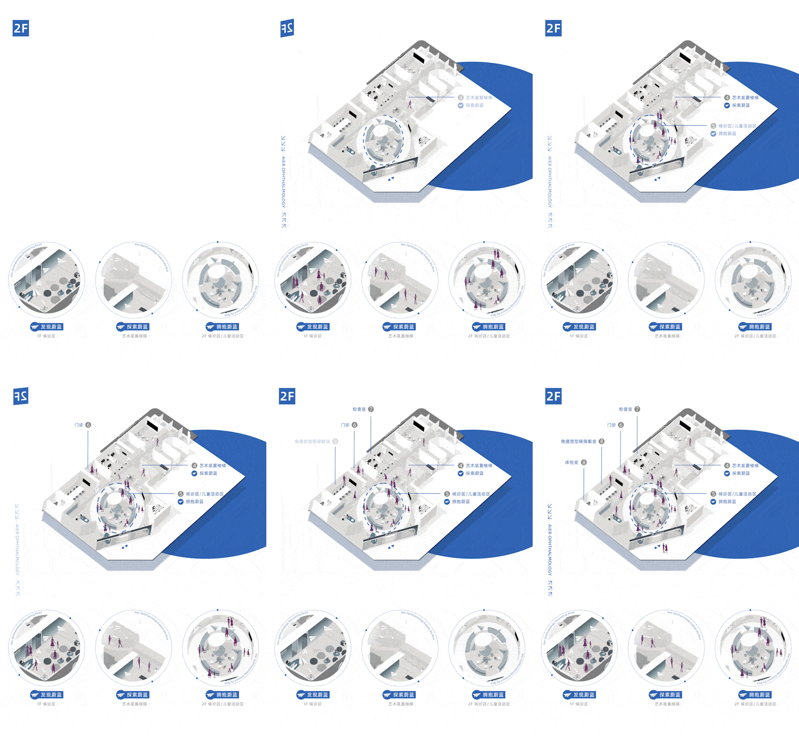
整体的空间设计以“蔚蓝”为核心,纸飞机为视觉锤,打造一个充满包容、开放、自由、健康的视光场所。以叙事的方式,将空间体验分成【发现蔚蓝】【探索蔚蓝】【拥抱蔚蓝】三大层次。在情感关联性和时间性上使空间形成一个有机整体,为单一空间赋予叙事的沟通性与动线的连续性。
The overall space design takes "Blue" as the core and paper plane as the visual hammer to create an inclusive, open, free and healthy visual place. In a narrative way, the spatial experience is divided into three levels: [Discovering the blue] [Exploring the blue] [Embracing the blue].It makes the space form an organic whole in terms of emotional relevance and timeliness, endowing the single space with narrative communication and the continuity of moving line.
*内即是外,围绕核心展开对话
Inside is outside, enter a dialogue around the core.
“自然光给予了空间特性,也给予建筑生命,否则没有一个空间是真实存在的。”——当代建筑师路易斯•康
"Natural light gives space character and also gives life to architecture, otherwise no space is truly exist."
——Contemporary architect Louis Kahn
空间中的对话性本身是无形的,品牌内核也是存在于无形之中被塑造。大面积落地玻璃所隔离形成的内外,被“蔚蓝”所裹挟,既是内部个体的自我表达,也是对开放与自由主题的向外探索,内即是外,外即是内。
The dialogism in space itself is intangible, and the core of a brand also exists and is shaped invisibly.The interior and exterior formed by the isolation of the large area of floor-to-ceiling glass are wrapped in "Blue", which is not only the self-expression of the internal individual, but also the outward exploration of the theme of openness and freedom, the inside is the outside, and the outside is the inside.

“孩时记忆中有着我最为深刻的建筑体验,在我后来的建筑作品里,我常常从当时的记忆中思索氛围与意向。”
——Peter Zumthor在瑞士谈到其儿时记忆
"In my childhood memories, I had the most profound architectural experience, and in my later architectural works, I often reflected on the atmosphere and intention from the memories of that time."
——Peter Zumthor talks about his childhood memories in Switzerland
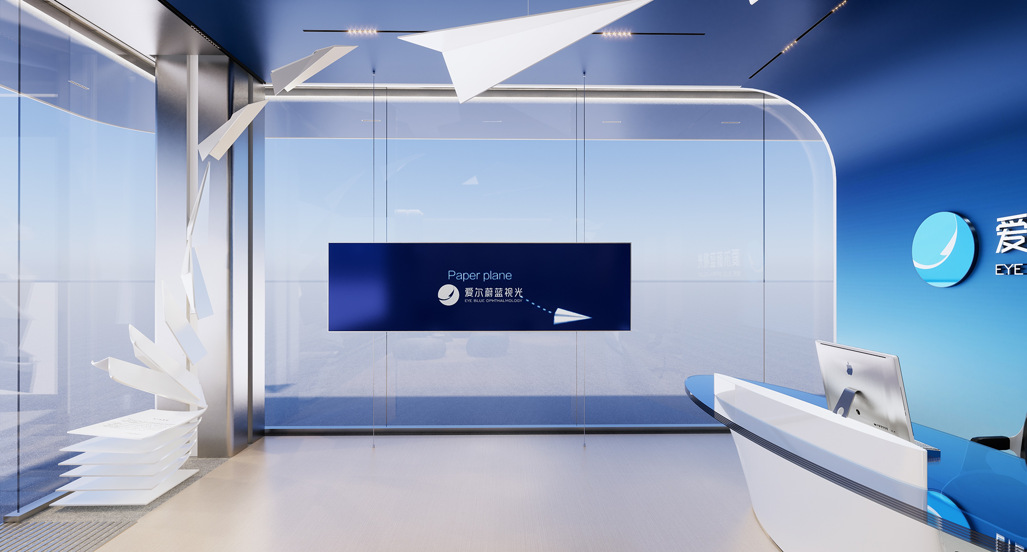
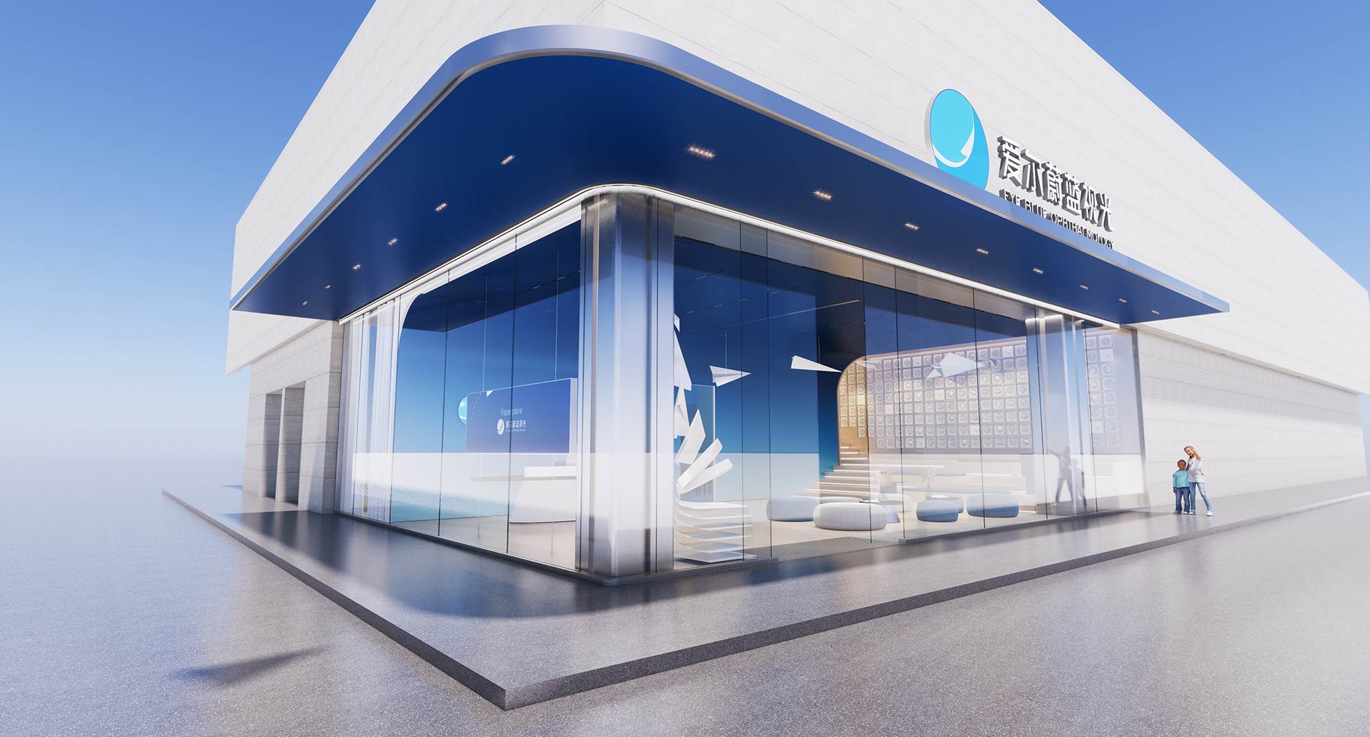
从童年记忆出发,我们找寻到代表着自由与探索的纸飞机作为空间的超级符号,简单又醒目。到访者好似发现了一个不真实又很真实的世界,好奇而欢快,在空间呈现的灵动中启发青少年更多天马行空的想象,无形间形成独特的对话体系以及有情感记忆的“精神象征”。
Starting from childhood memories, we find the paper plane representing freedom and exploration as a super symbol of space, is simple and eye-catching.The visitors seem to have discovered an unreal and very real world, curious and cheerful, inspiring teenagers to imagine more wild imagination in the spirit of space presentation, and invisibly forming a unique dialogue system and a "spiritual symbol" with emotional memory.
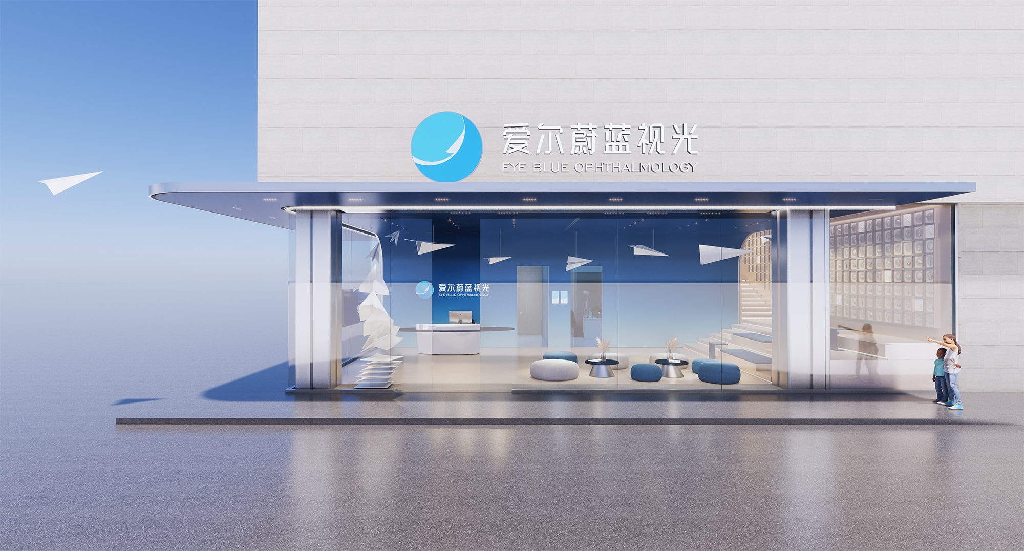
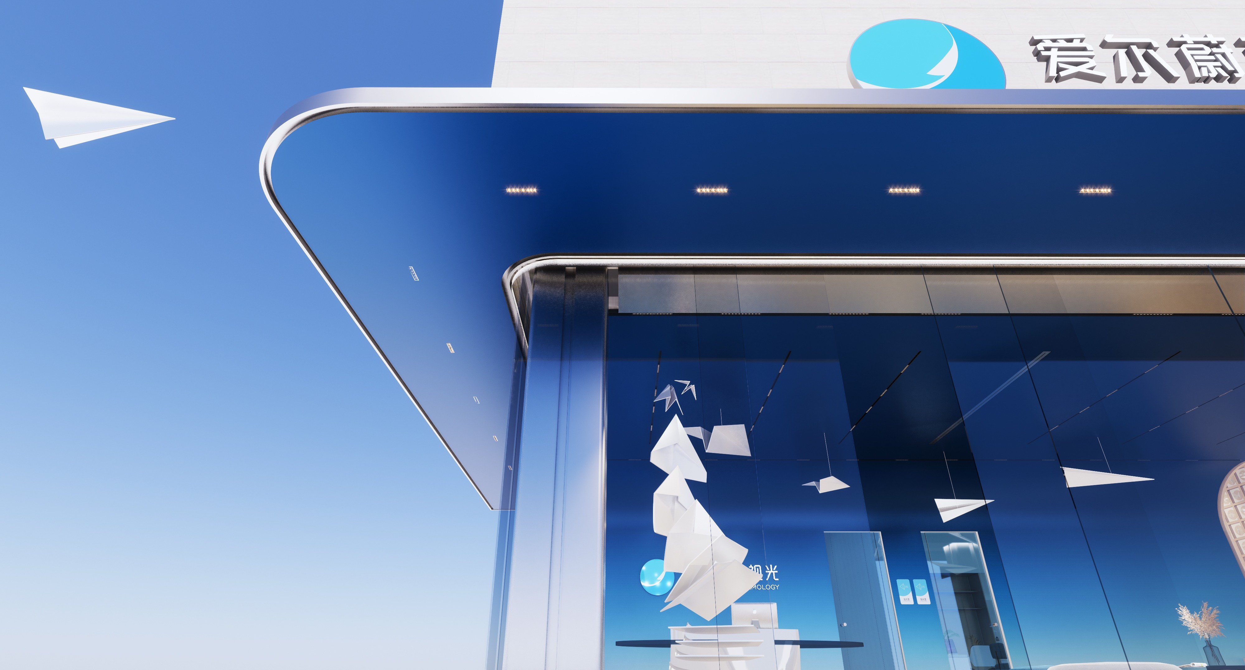
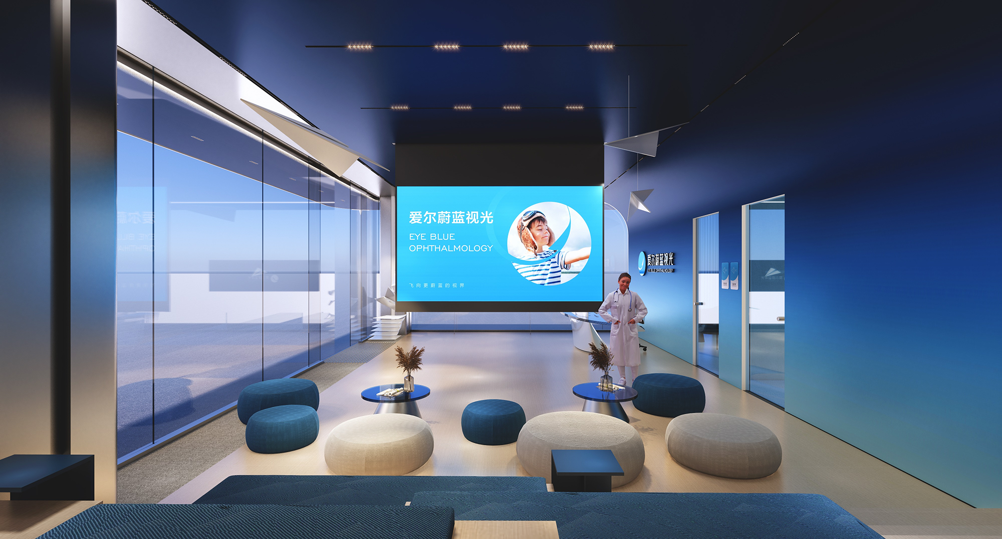
一张纸的重量,飞出不一样的高度。向天空投射梦想,演绎青春的快乐。
The weight of a piece of paper flies to a different height.Projecting dreams into the sky, interpreting the joy of youth.

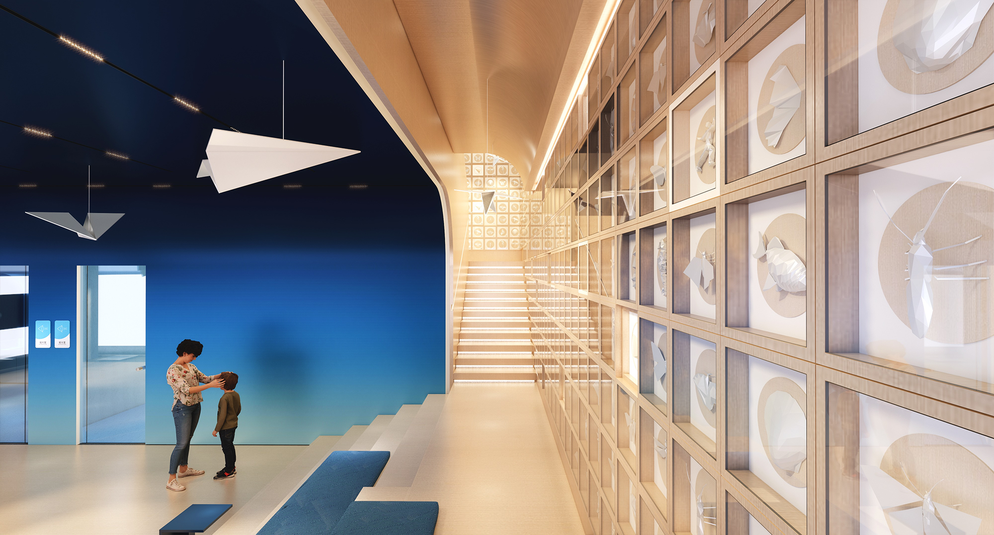
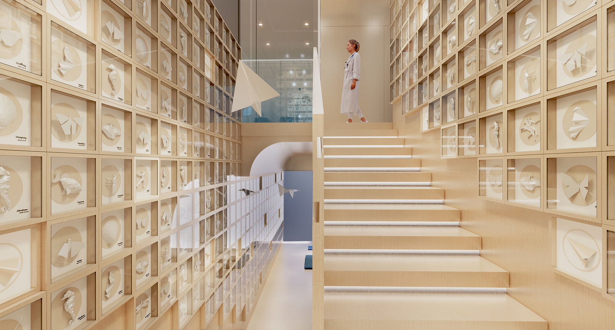
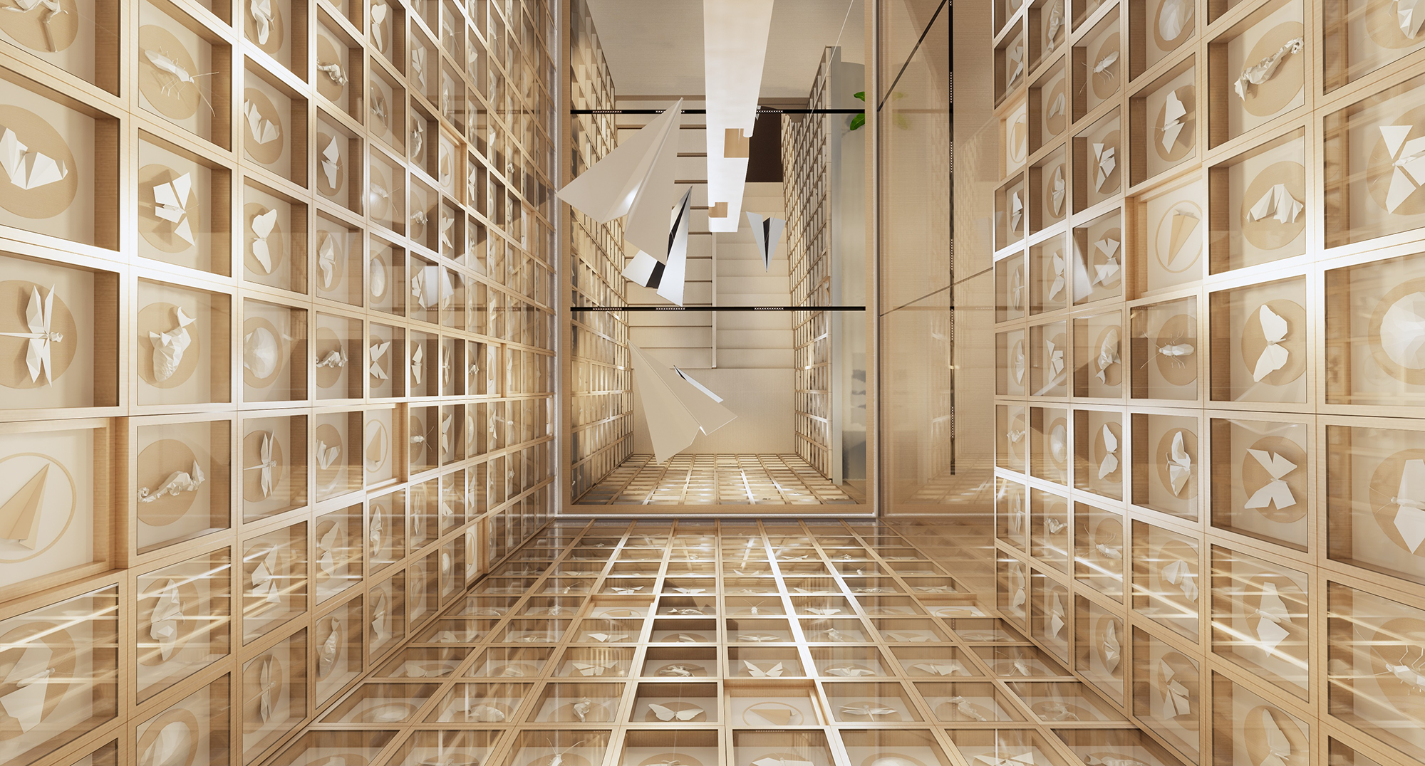
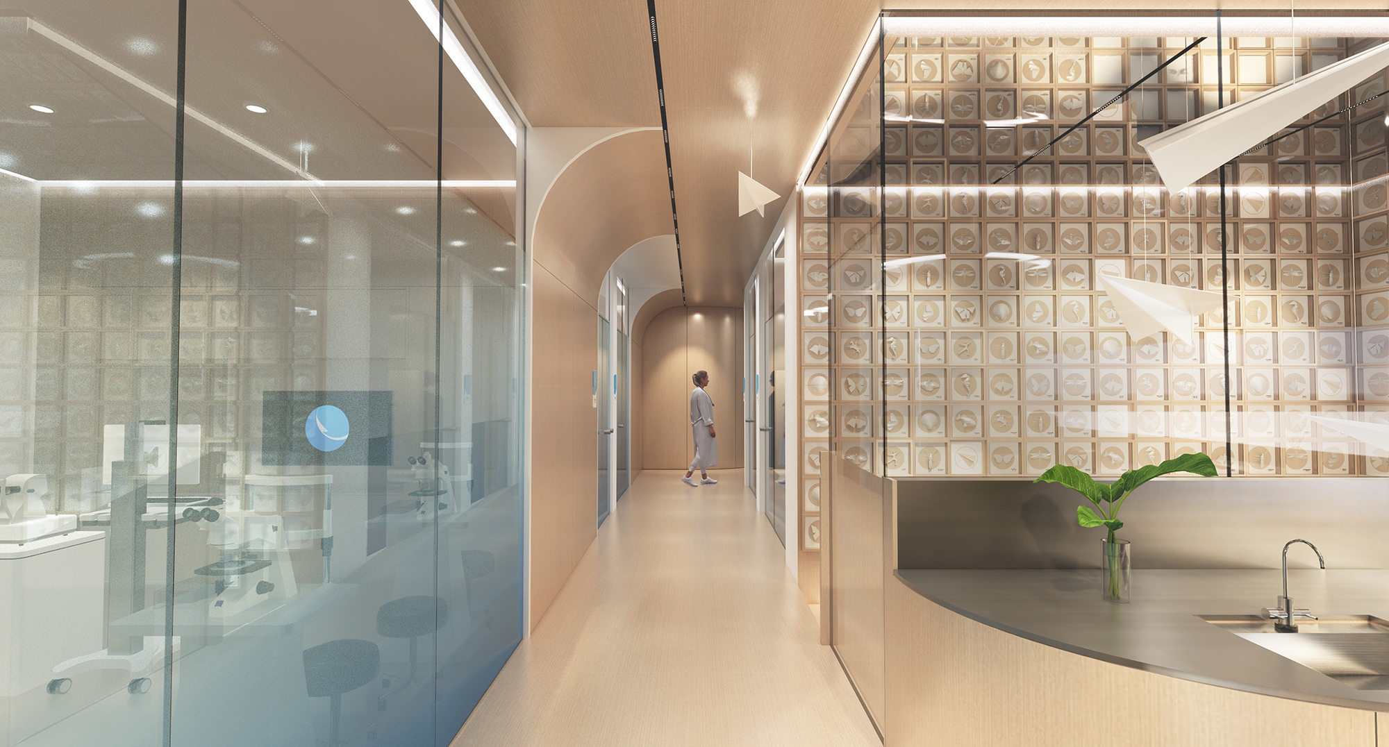
通往二楼的木质楼梯,像是一条通往“未来世界”的天梯。由无数个木质方盒子构筑而成的大型装置墙强调“探寻与寻找”,以折纸的设计语言再次延伸,展示着美妙的万物生灵,好似一个个生动变化的表情。在暖和的色调下,不止有艺术呈现的美感,更是激发儿童及青少年对未来世界的渴望与憧憬。
The wooden staircase leading to the second floor is like a ladder to the "future world".The large installation wall constructed from countless wooden square boxes emphasizes "exploration and search", and is once again extended with the design language of origami, showcasing the beautiful creatures of all things, like vivid and changing expressions.Under the warm colors, there is not only the beauty of art presentation, but also inspired the desire and longing of children and teenagers for the future world.
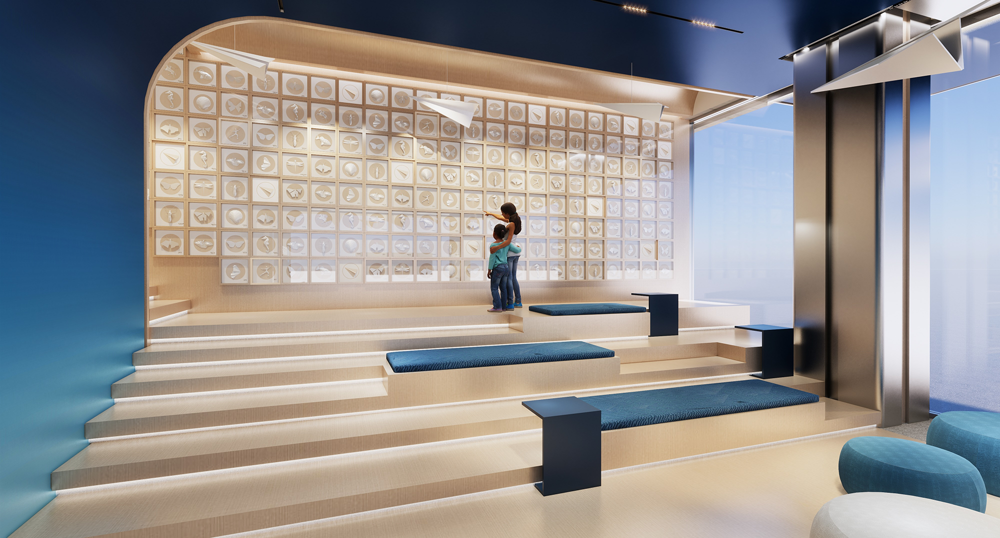
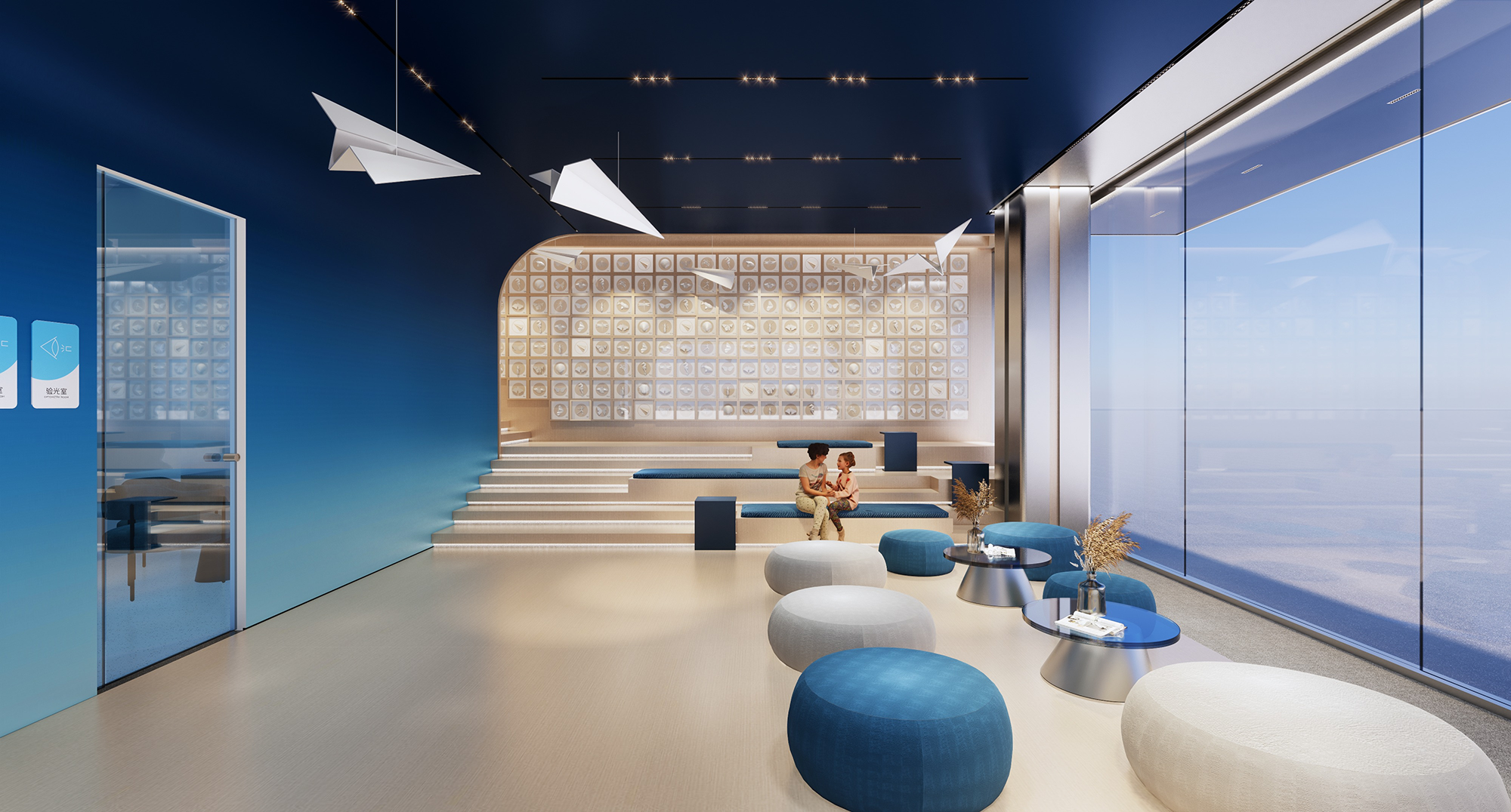
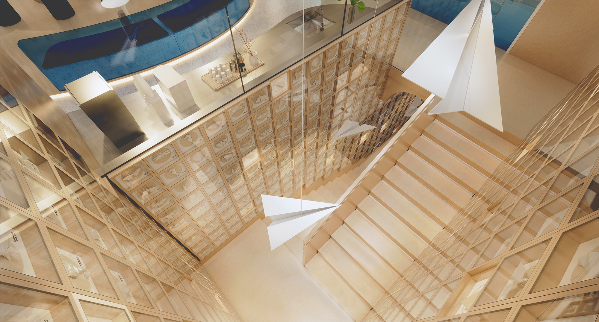
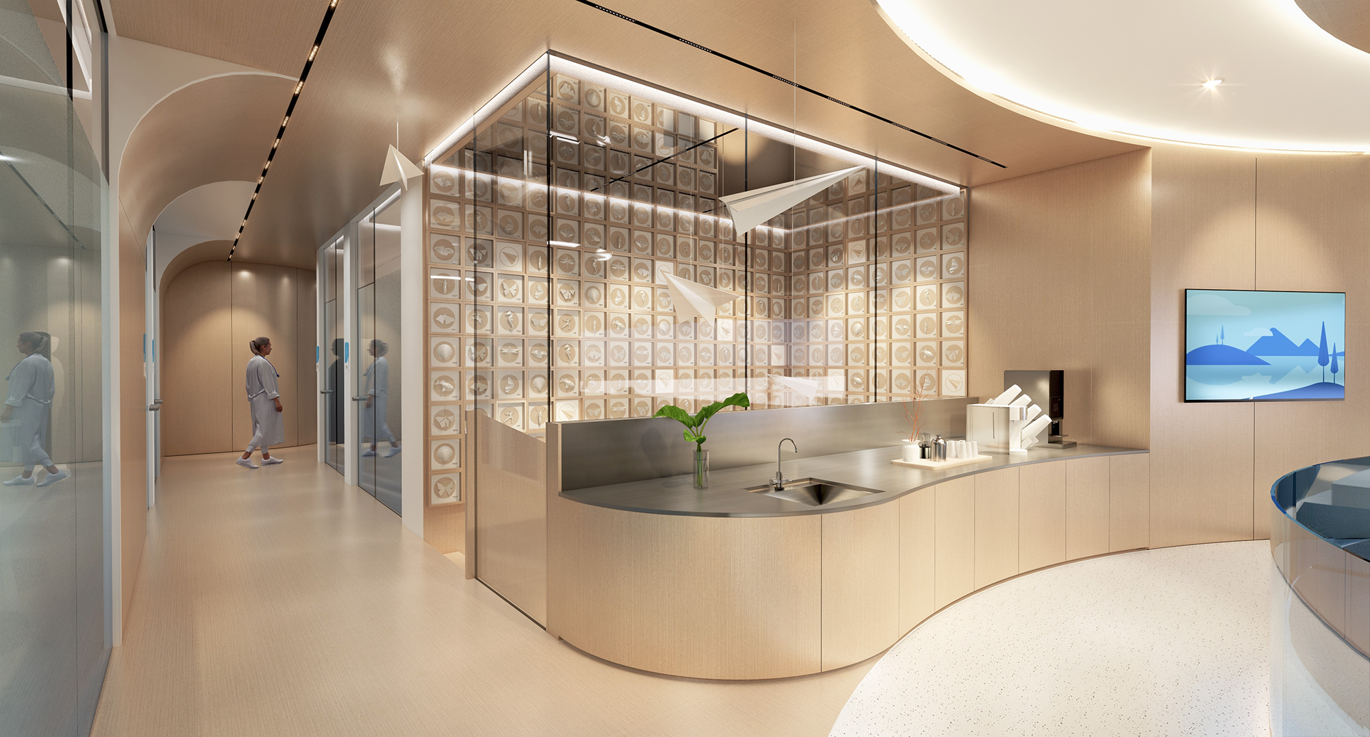

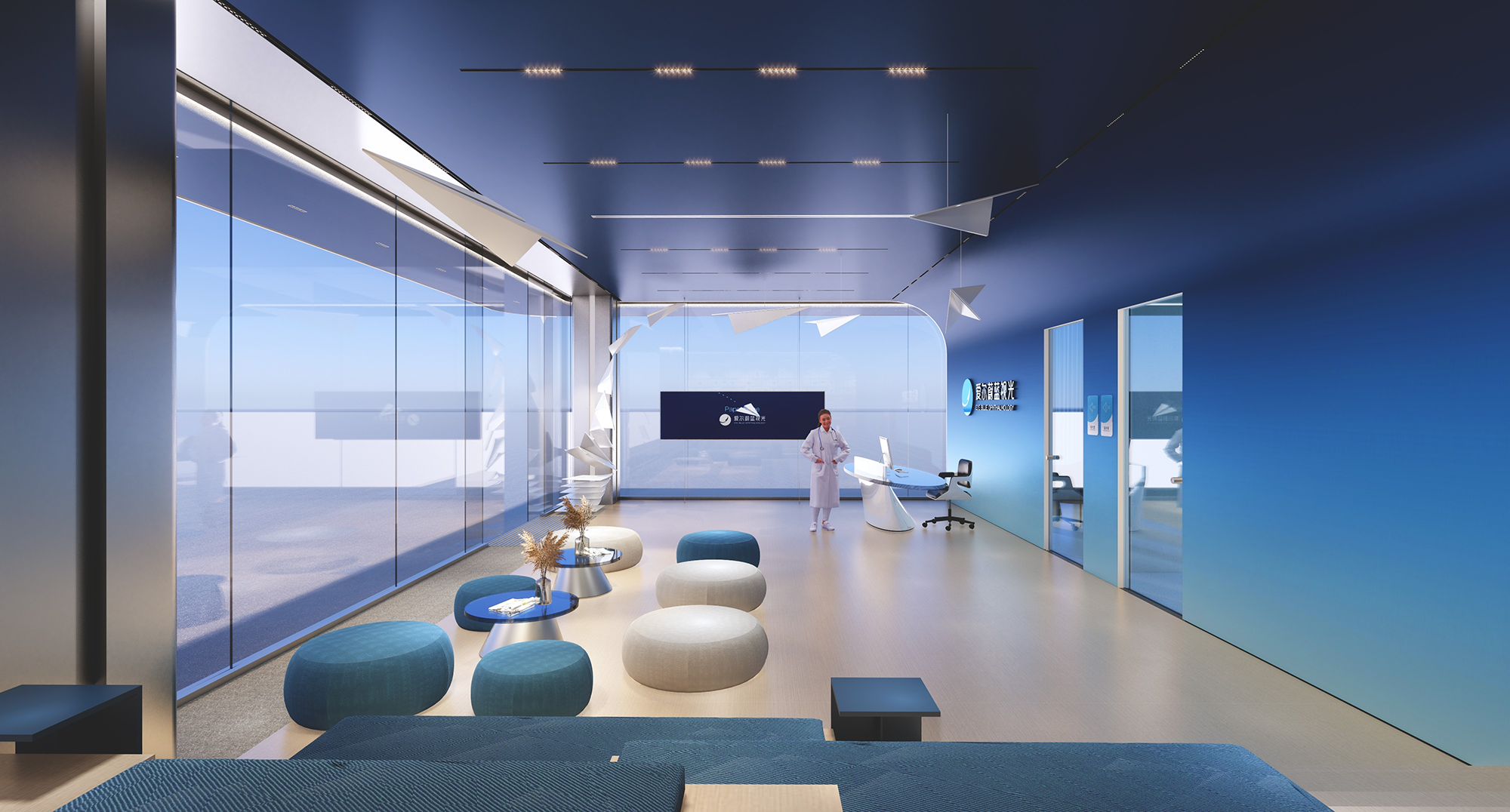
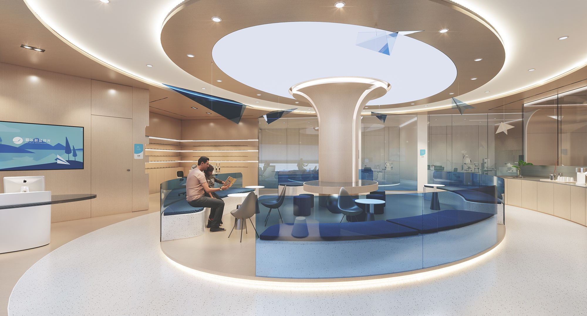
等候区立于空间二层核心位置,以弧形、圆形最简单的要素,形成聚拢感与向心力,配合天花板上呈同心圆状的照明,好似从空间中生长出来一般,并自带着一种向上而强烈的力量,将空间无限延续引发遐想。当置身其中,自然而然的生长状态启迪青少年健康成长,发现更遥远的未来。
The waiting area is located at the core of the second floor of the space, with the simplest elements of arc and circle, forming a sense of convergence and centripetal force. With the concentric circles lighting on the ceiling, it seems to grow out of the space, and with a strong upward force, it will continue the space indefinitely and trigger reverie.When immersed in it, the natural growth state inspires teenagers to grow healthily and discover a more distant future.
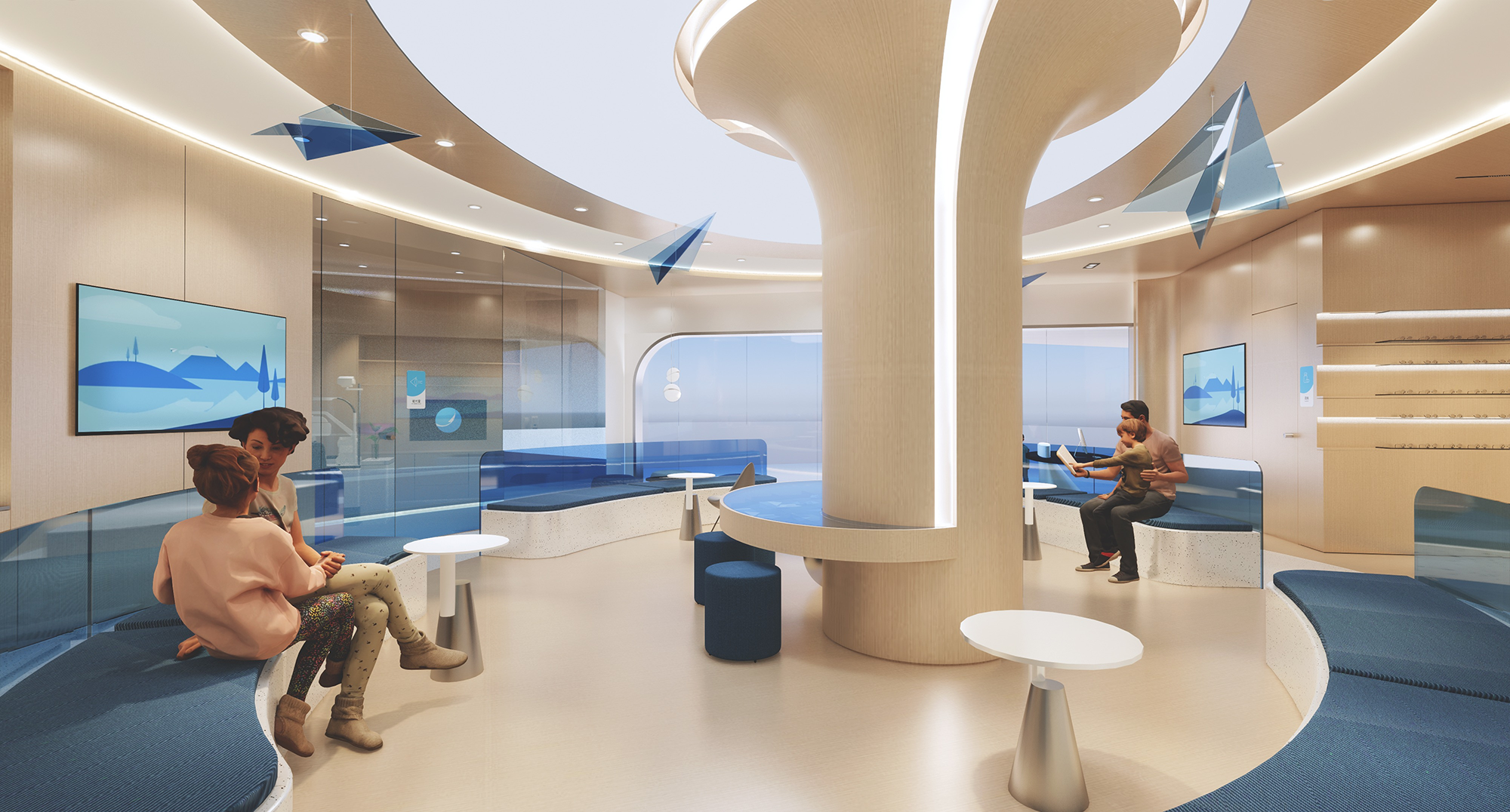
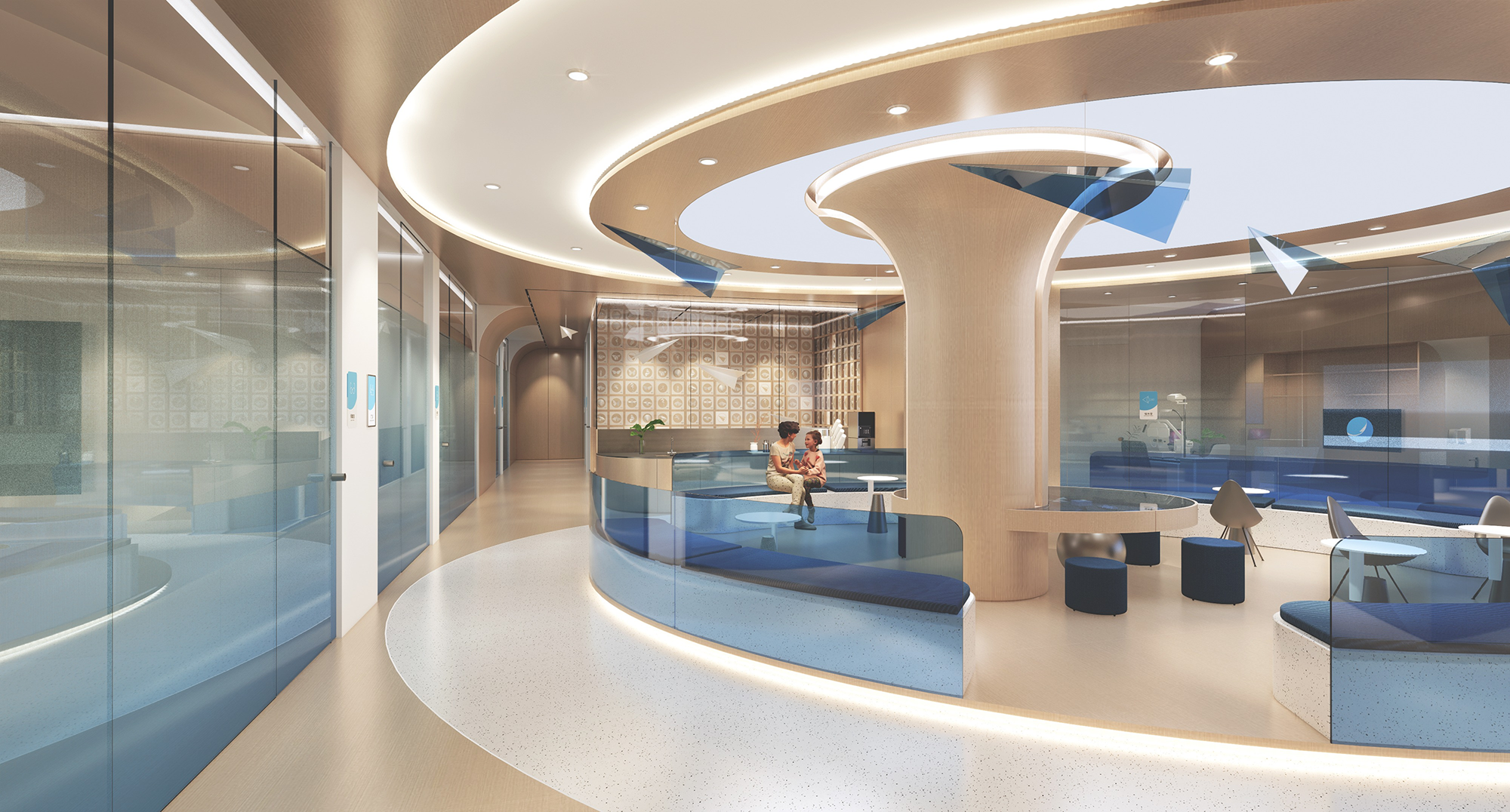
浅木色给人温暖、健康、包容感,渐变蓝给人亲切、自由、科技感,白色给人专业、开放感。整体营造出的科技专业感与未来感,隐含“整个过程如理化实验般考究精准”的潜台词。
Light wood color gives a warm, healthy, and inclusive feeling, gradient blue gives a friendly, free, and technological feeling, and white gives a professional and open feeling.The overall create a sense of technological professionalism and futurism implies the subtext of "the entire process is as precise as physical and chemical experiments".
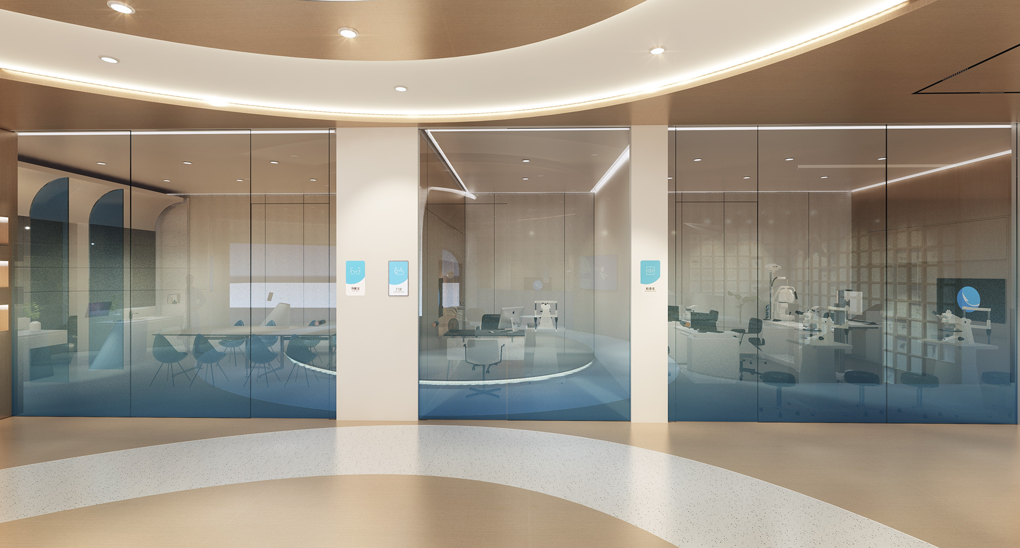
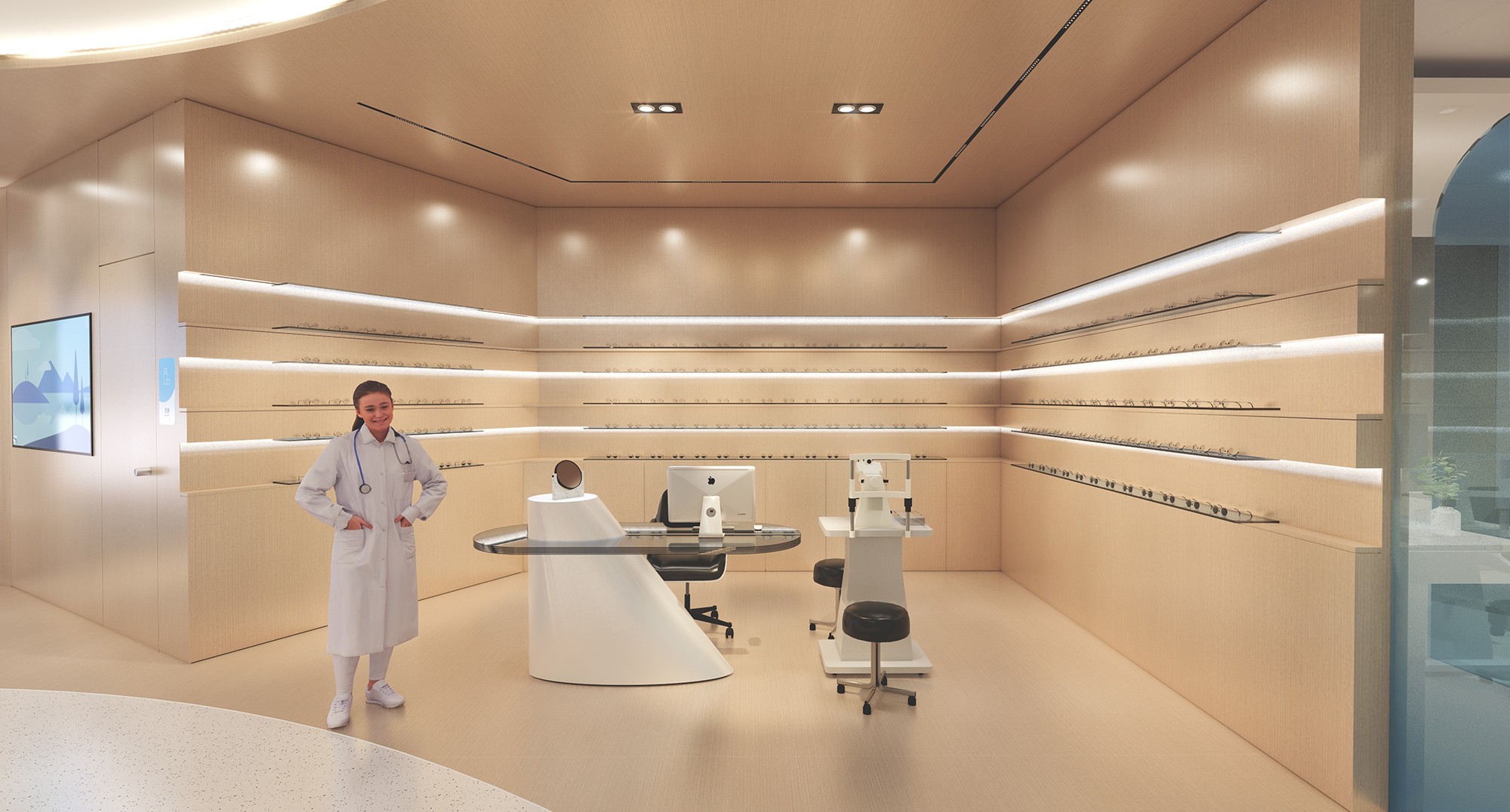
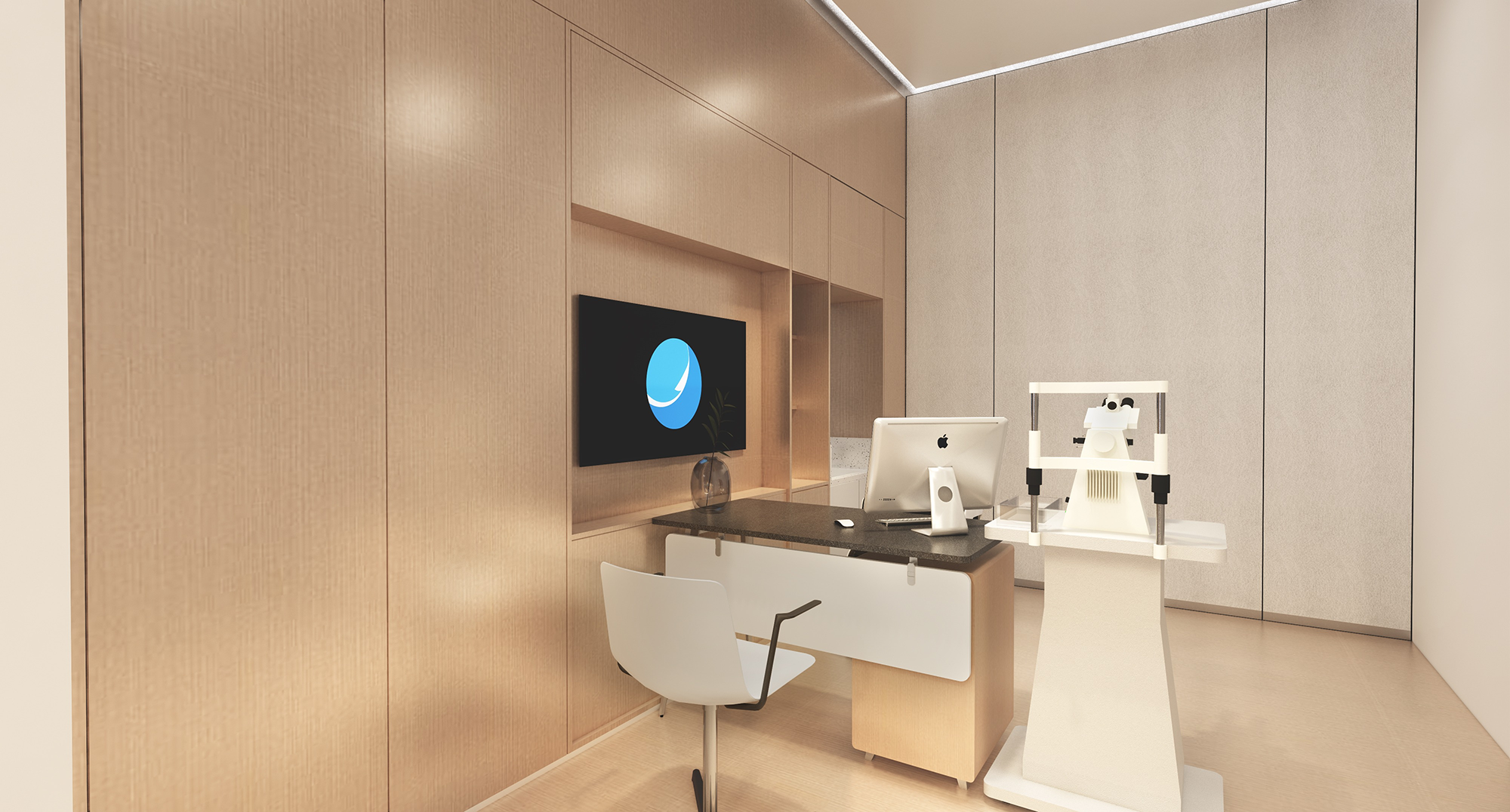
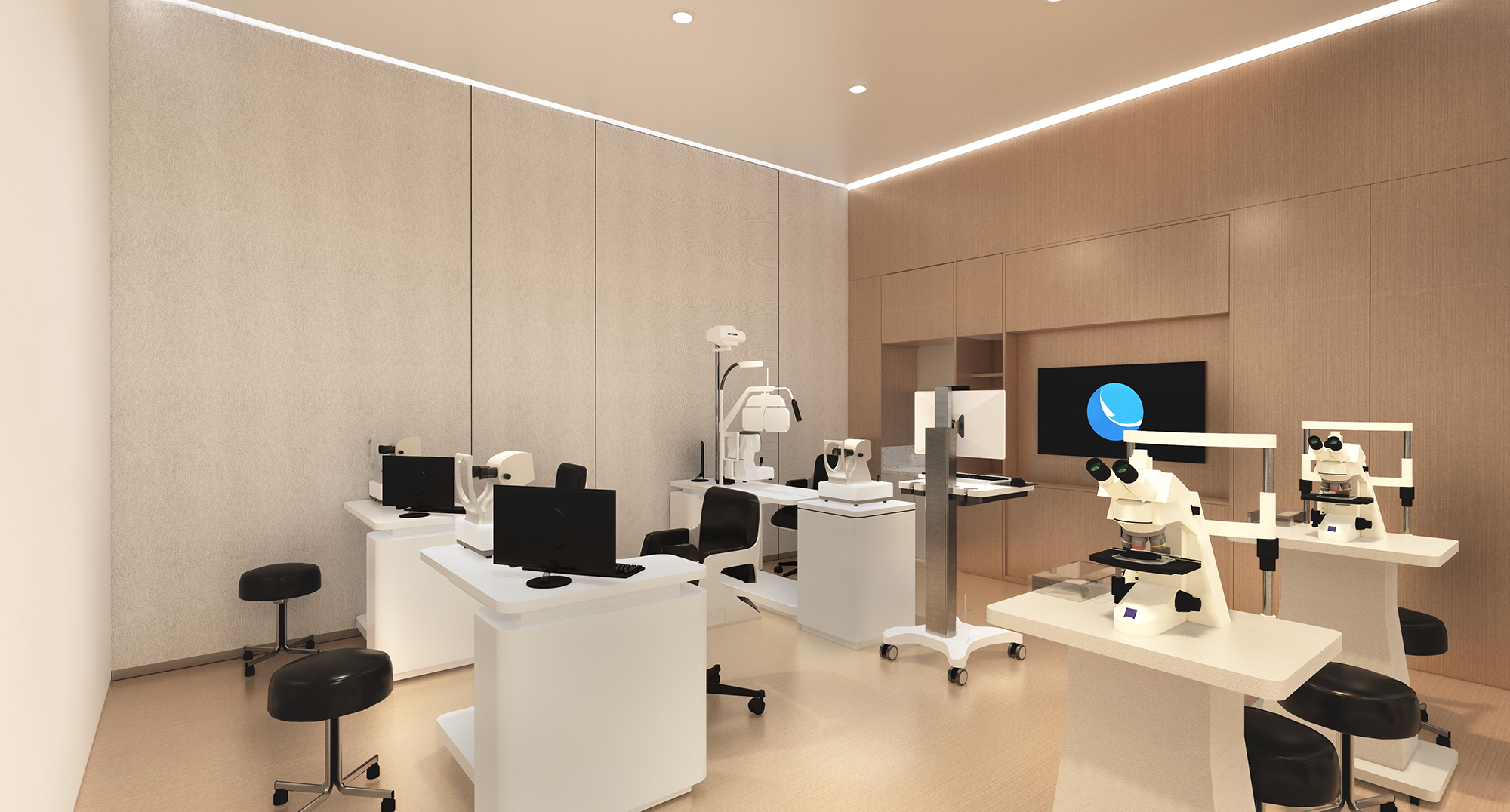
在强调内外空间对话时,创造出一种全新的、立体的、情感的关联,表面引导与内在启迪,让青少年在美好空间里,得以无限纯粹的蔚蓝畅想。
When emphasizing the dialogue between internal and external spaces, it creates a new, three-dimensional and emotional connection, surface guidance and inner enlightenment, so that young people can have infinite pure blue imagination in a beautiful space.

爱尔作为上市企业,眼科领域的top.1,需站在更高的角度在承接对下一代的关怀与包容上提出建议。因此,我们希望在视觉沟通、空间体验上传递包容、开放、自由、健康的理念,以“蔚蓝”引导和启迪青少年充满探索精神,飞向更蔚蓝的视界,看见更多的惊喜和可能。
As a public company and the top 1 in the field of ophthalmology, Aier needs to put forward suggestions from a higher perspective to undertake care and tolerance for the next generation.Therefore, we hope to convey the concepts of inclusive, open, free and healthy in visual communication and spatial experience, guiding and inspiring young people with a spirit of exploration through "Blue", flying towards a more blue visual, and seeing more surprises and possibilities.
D&M店与面,秉承“让零售创新更有趣有效”的设计理念,聚焦新零售领域的品牌升级以及空间创意体验设计。我们致力于在零售创意领域为不同行业的前瞻性客户,打造最顶级的零售空问创意体验和品牌营销推广的视觉设计。
D&M adhering to the design concept of "making retail innovation more fun and effective" ,focus on brand upgrading and space creative experience design in the new retail field. We are committed to creating top-notch retail space creative experience and brand marketing visual design for forward-looking clients in different industries, create top- notch visual design for retail space creative experience and brand marketing promotion.

项目名称:爱尔眼科视光门诊
委托方:爱尔眼科医院集团股份有限公司
设计方:店与面(广州)创意设计有限公司
设计师团队:邱启平、李东辉、袁善铭、盛威、李玉青、唐银
公司网站:http://www.shopvmd.com/
项目地址:中国 长沙
面积:300㎡
视觉&媒体管理:李帆、原启桉
撰文:符宝澜
Project name:Aier Ophthalmology Clinic
Client:Aier Eye Hospital Group Co., Ltd
Designer:D&M (Guangzhou) Creative Design Co., Ltd
Designer Team:Qiu Qiping,Li Donghui,Yuan Shanming,Sheng Wei,Li Yuqing,Tang Yin
Company website:http://www.shopvmd.com/
Project address:Changsha,China
Area:300m²
Visual & Media management:Li Fan,Yuan Qi'an
Written by:Fu Baolan